

Back to Works
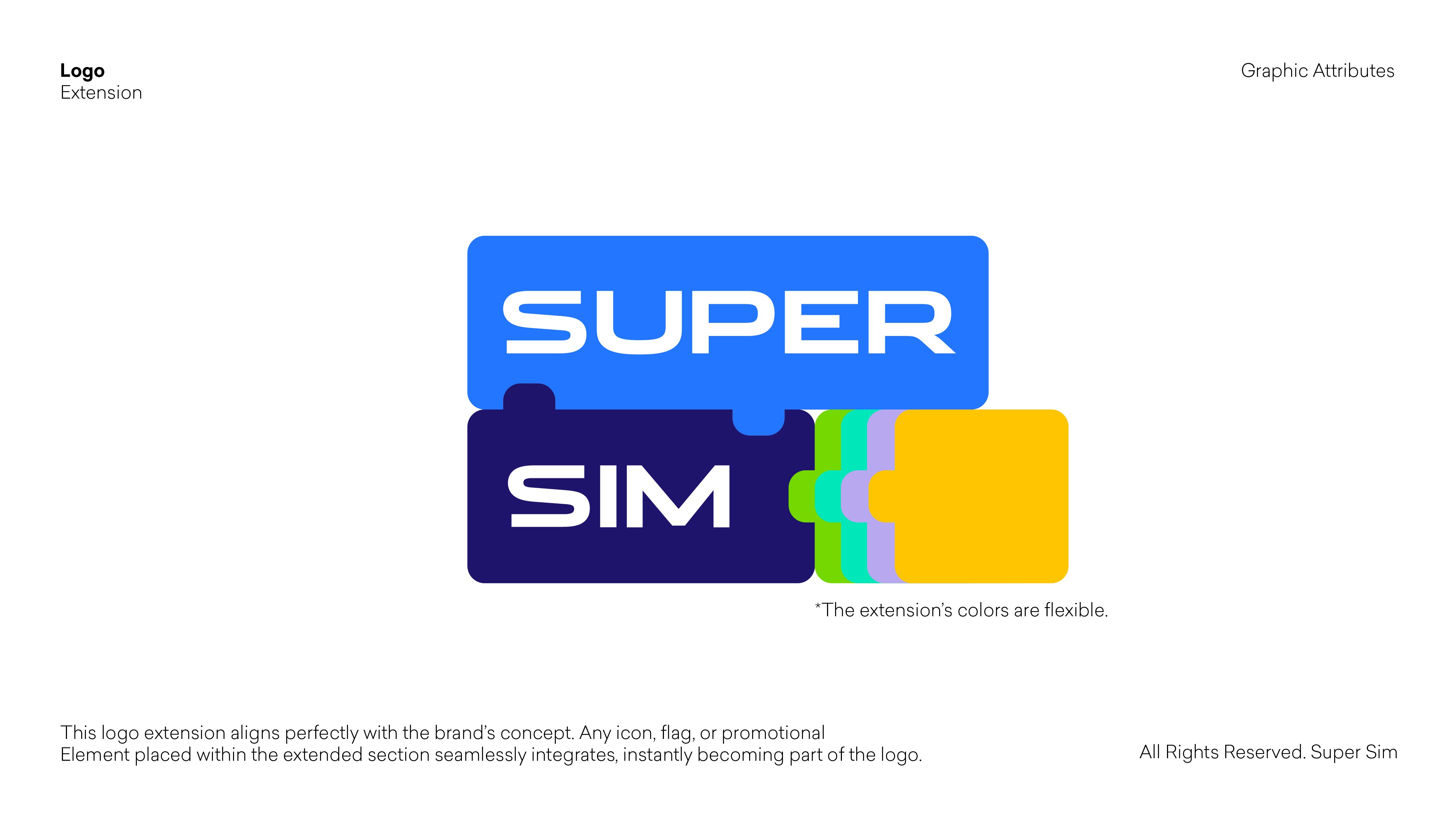
The design of our logo is rooted in the very essence of what a SIM card represents.
We looked closely at the golden contact surface of the original SIM card: The intricate cracks, joints, and geometric patterns that make it instantly recognizable.
These tiny engraved lines are more than just functional pathways for connectivity; they symbolize the invisible network of connections that allow people to communicate, share, and stay connected across the world.
SUPER SIM
Rebranding Project
From our studio RECKLESS STUDIO
2025